Mellowdrama
.svg)

Brand
Mellowdrama is a denim-wear fashion label founded in 2016. The brand’s evolving design language distanced it from its old identity, which was laden with more subtle and cleaner silhouettes. We came on board to re-position, brand and create a distinct language that would embody the electrifying energy of drama and the inherent oxymoron of the new identity.


Mellowdrama’s new identity thrives on contrast—glamour meets comfort, expression meets ease. The bold ‘M’ lettermark captures this spirit, inspired by pattern cutting and denim remnants that naturally form its shape. More than a symbol, it’s a functional brand signature designed for versatility across jeans, t-shirts, and beyond—blending spontaneity with strong design roots.


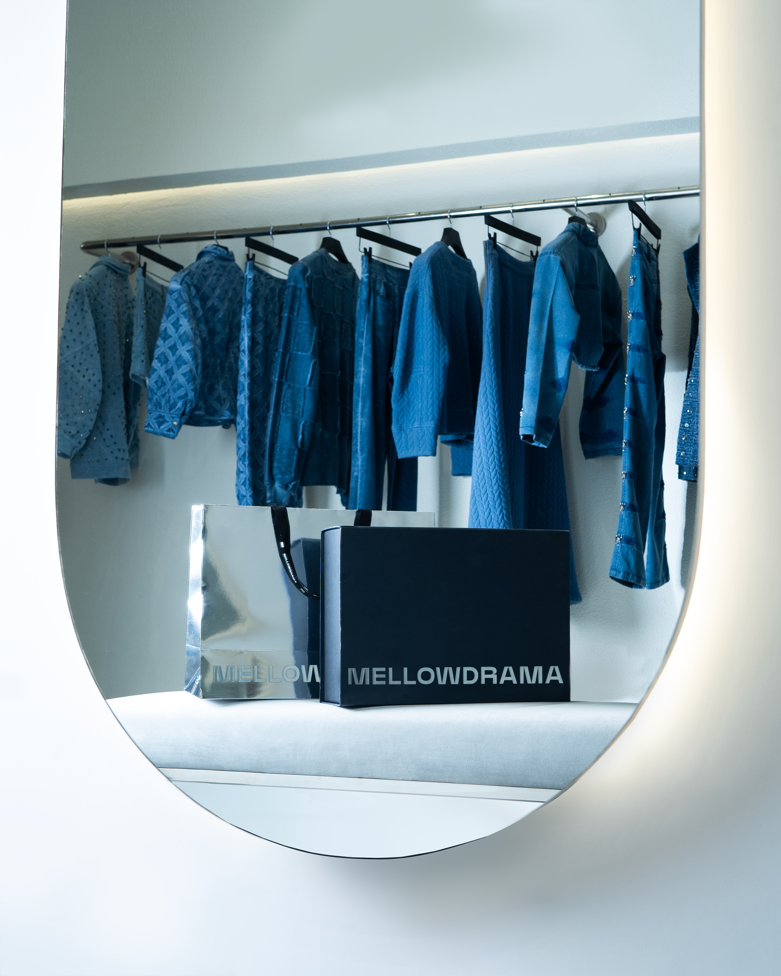
Our packaging reflected the oxymoron inherent in the brand name with a juxtaposition of traditional denim blue shades and a strong metallic silver to highlight the dramatic tension behind the name. The clothing tags read ‘Bold Comfort’ – a nod to denim’s understated charm, combining ease with unapologetic spirit.


Mellowdrama’s website captures the brand’s bold, contrasting design language—elegance with edge. A custom typeface, deep blue and black tones, and accents of silver bring its personality to life. The striking use of the logo as a footer anchors the site with a confident, memorable finish.


Social Media Visual Style


projects
