Kaméi
.svg)
Logo
FIO Restaurants approached us to create an identity for their latest venture—an authentic and transformative Asian Restaurant that we named Kamei or Turtle. The design for the letter mark ‘K’ was inspired by the free-flowing strokes of Japanese calligraphy, which also bore semblance to the motion of ripples and sea currents. Evoking Asian heritage with a modern approach, our letter mark consisted of minimal serif and sculptural forms–energetic yet serene.
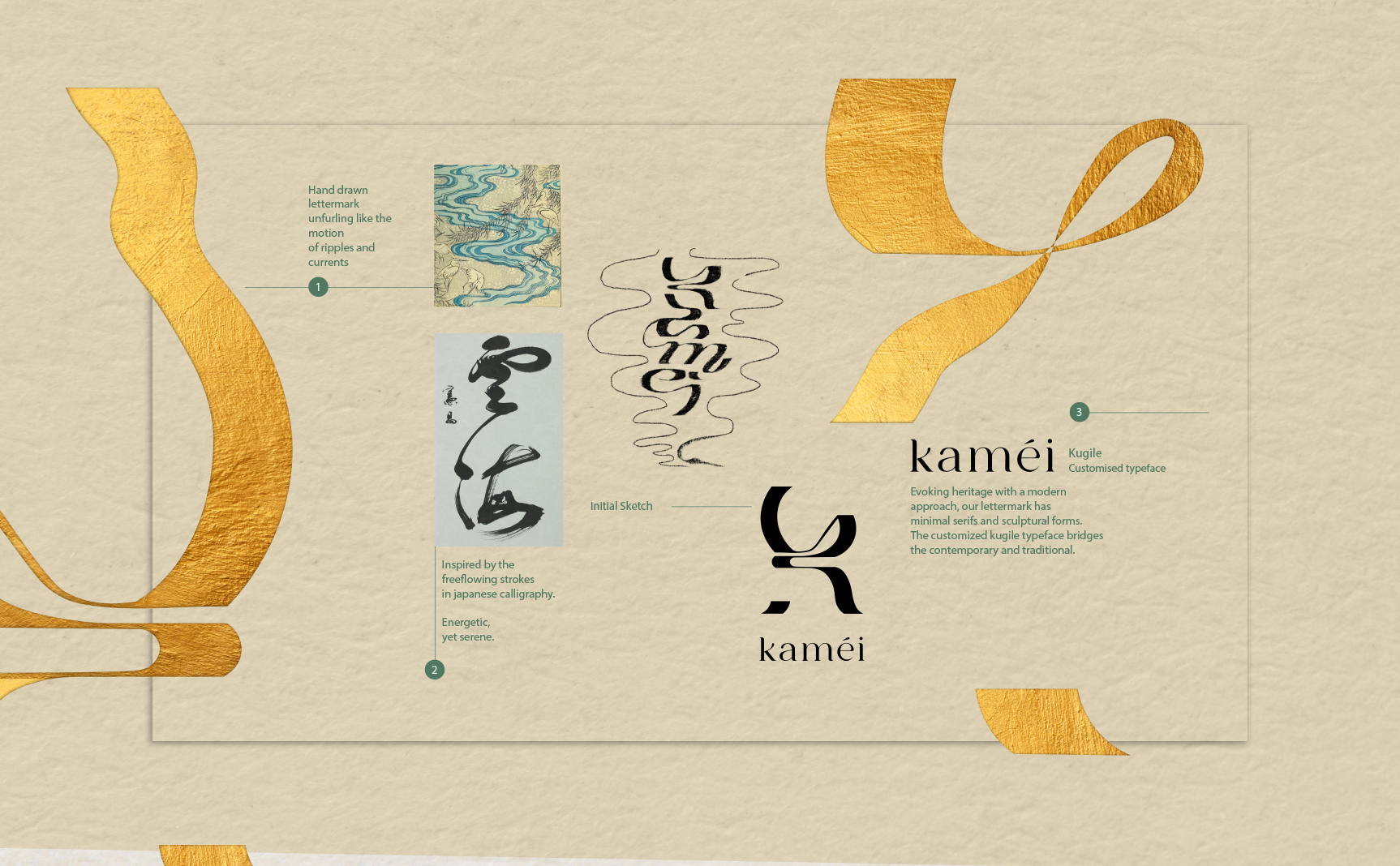


Kaméi translates to ‘turtle’ in both Chinese and Japanese languages. Playing a major role in Asian culture, it represents one of the four auspicious beasts, believed to be endowed with the secrets of heaven and earth. For us, Kaméi symbolized the spirit of exploration through cuisine and the many cultural nuances that follow with that pursuit.
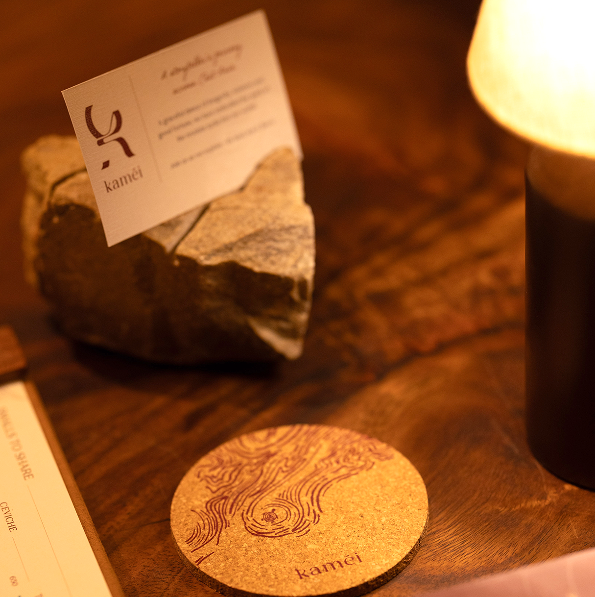

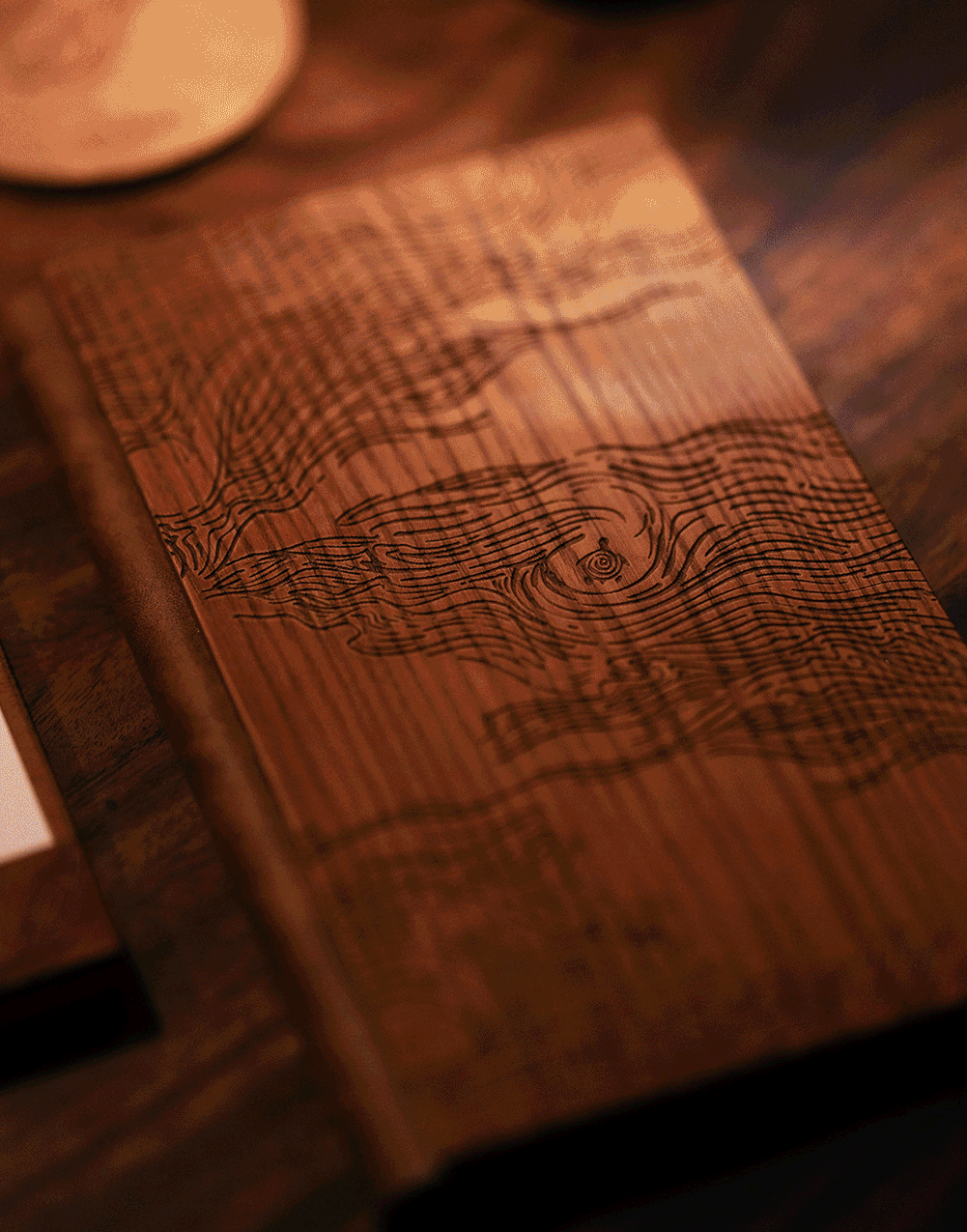
The Asian current served as visual inspiration for the Menu cover etching, while the beverage menu's core ingredients served as visual inspiration for our Cocktail Menu. All hand illustrated and foiled patterns were an anchor for the visual design. For the walls, we made hand drawn panels featuring chrysanthemums, seaweed and sea currents/waves – each being a key part of the continent’s culture – printed on rustic cement tiles.


Social Media Visual Style


projects
